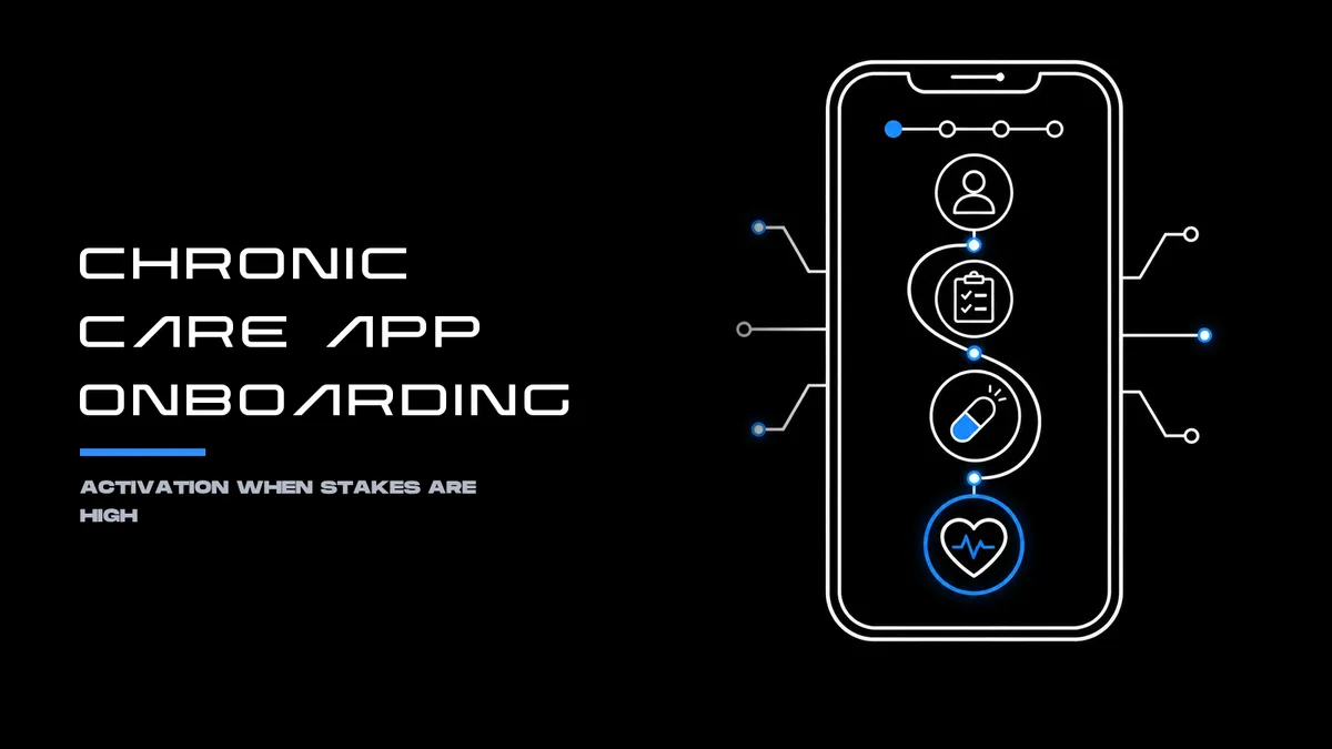
Chronic Care App Onboarding: Activation When Stakes Are High
Featured in 15+ major media publications (including Forbes, Wired, Yahoo Finance, AP, and Telemundo) Mr. Ortiz brings 25+ years of experience, 172 managed projects, and a record connected to 1.52 million happy customers. He earned a place on Top 100 Magazine’s Top 100 Innovators in US list and owns one US utility patent with a CIP. His healthcare client record spans Medicare Advantage providers, a global pharmaceutical company, a federal healthcare agency program, and digital health startups.
In chronic care, onboarding sets the terms for what follows. It shapes whether a patient can access the app, understand the care plan, complete a first useful action, and return when life or symptoms interrupt the routine. A polished welcome screen is not activation. Activation is a meaningful, accessible first step that fits the person’s care context.
About: Activation Means Reaching First Value
A chronic-care app should define activation around a useful behavior, not a download, account creation, or streak. Depending on the product, that first-value moment might be completing an initial check-in, reviewing a care-plan task, recording a relevant measurement, or establishing a consent-based caregiver connection.
Each step needs a clear purpose. Patients should understand what the app is asking them to do, why it matters, and what will happen next. A short path to one useful action often serves people better than a long intake sequence that demands extensive personal information before offering value.
That does not mean skipping necessary setup. It means sequencing it. Essential access, safety, and care-context information belongs early; optional profile details and secondary features can follow. Progressive disclosure helps keep the first session focused without hiding important controls.
A 2026 prospective study of onboarding for a chronic-pain self-management app found that hands-on onboarding improved adoption compared with email-only onboarding. The study also distinguished adoption from ongoing engagement: stronger initial uptake did not, on its own, guarantee sustained use. That distinction is central to product design. A successful first session is a starting point, not proof of long-term adherence or better health.
Motivation: Streaks Must Respect Clinical Reality
Streaks can make repeated actions visible, but chronic care does not follow a perfect daily calendar. Pain, fatigue, changing symptoms, work, caregiving, connectivity, and treatment schedules all affect whether a person can complete a task on a particular day. A missed check-in should not feel like a moral failure, or encourage someone to push past symptoms to preserve a badge.
A more responsible design treats streaks as optional feedback rather than the primary measure of success. Flexible continuity can recognize weekly participation, allow a planned pause, and make it easy to resume after a gap. The app can reinforce returning to a care routine without implying that every task is appropriate every day.
The underlying product principle is straightforward: celebrate useful actions, not unbroken compliance. A streak is an interface mechanic. It is not a clinical outcome, a measure of health, or a reliable stand-in for adherence.
Caregiver Onboarding: Separate Roles, Explicit Consent
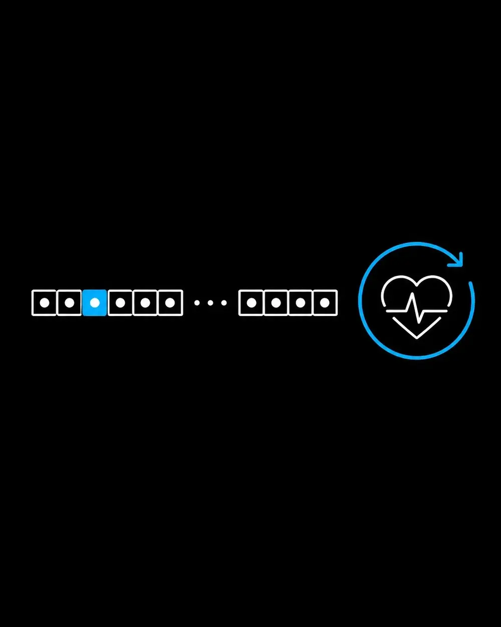
Caregivers can support routines, reminders, and communication, but they are not automatically an extension of the patient’s account. A well-designed app treats the patient and caregiver as distinct users, with separate identities, permissions, notification preferences, and onboarding paths.
The invitation flow should explain what information will be shared and what the caregiver can do. The patient should be able to accept, understand, and revoke access. The caregiver should see a practical first action that fits the permission granted, not a full patient dashboard by default.
Role-specific setup also reduces avoidable confusion. A patient may need help completing a personal task; a caregiver may need guidance on acknowledging a shared item or sending encouragement. Both need clear boundaries. Research on older adults and caregivers using mobile support tools found differences in how the two groups understood features and the training they needed. That is a reason to test both journeys, not assume that one onboarding path fits both.
Facts: Measure Activation, Engagement, and Outcomes Separately
A practical measurement plan distinguishes product use from care outcomes. Teams can define and review separate measures for:
- Activation: completion of the first meaningful care action, successful access, and any essential connection.
- Engagement: return use and completion of relevant tasks over a defined period.
- Caregiver participation: invitation acceptance and activity within the granted role.
- Usability: task success, errors, support needs, and time or effort required to complete key steps.
- Accessibility and equity: whether people using assistive technology or different devices, languages, and levels of digital confidence can complete the same essential tasks.
- Clinical and safety outcomes: condition-appropriate measures, governed by the product’s intended use and clinical oversight.
Teams should state each metric’s numerator, denominator, and observation window. They should also examine why people stop: unclear instructions, inaccessible controls, notification overload, technical friction, or a mismatch between the app’s requests and the care routine. Opens, downloads, and streak length may help describe app activity. They do not prove that a patient completed a meaningful behavior or experienced a health benefit.
For digital health products, product analytics should work alongside appropriate clinical and safety evaluation. The FDA’s guidance on device software functions explains that regulatory considerations depend on the function and intended use of the software. Product teams should not treat engagement metrics as evidence of clinical effectiveness.
Accessibility: Build the First Session for More People
Accessibility belongs in onboarding from the start. Patients may use screen readers, larger text, voice input, captions, keyboard navigation, or other accommodations. A first-use journey that depends on tiny targets, color-only status, dense instructions, or a timed prompt can block access before the product has a chance to help.
WCAG 2.2 provides a strong design and testing reference for web content, while W3C’s mobile guidance addresses how accessibility principles apply across mobile experiences. For product teams, the work includes clear labels and focus order, readable text, visible focus, sufficient contrast, alternatives to color-only cues, and instructions that remain available when needed. Authentication and error recovery also deserve attention: people should have accessible ways to enter, regain, and continue using an account.
An ADA compliant website design approach is part of a broader accessibility practice, not a substitute for testing the actual app experience. Automated checks can catch some issues; hands-on testing with people who use assistive technologies reveals whether essential tasks work in real conditions.
When a digital health product may fall within FDA oversight, usability and human-factors work should reflect its intended users, use environments, functions, and risks. Regulatory applicability depends on the product. This article is educational and is not legal or medical advice.
Skills: Product Strategy Meets Execution
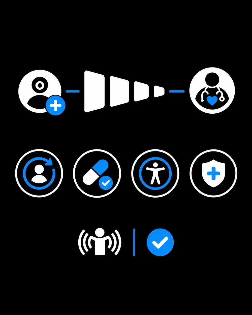
Mr. Ortiz combines product design, UX/UI design, business analysis, and digital strategy to frame onboarding as part of the complete product experience. His skill ratings include UI/UX design at 95%, product management at 95%, business acumen at 90%, and ADA compliance at 90%.
For chronic-care products, that work can include a UX audit of key journeys, research into patient and caregiver needs, and evaluation of activation friction. It can also include prototyping and product improvement, with attention to accessibility, analytics, and the operational realities around ongoing care. Teams seeking UX UI design services, mobile app design services, a product design consultant, or a ui ux agency can use digital product strategy to align those elements around a clear first-value journey.
He brings both strategic direction and hands-on execution: defining what activation means, mapping the steps that lead to it, and identifying where design or process improvements can reduce friction. The outcome is a product experience built for real routines, not just ideal usage.
A More Useful Standard for Onboarding
High-stakes onboarding succeeds when people can reach a relevant first action, understand their choices, and return without shame after an interruption. It gives caregivers defined, consent-based roles. It treats accessibility as a core requirement and measures activation separately from ongoing engagement and health outcomes.
For teams improving an existing experience or developing a new one, you can get help with product research, a UX audit, accessibility, and onboarding strategy. The goal is a clear, usable path that respects the realities of chronic care.
References
• Impact of Different Onboarding Strategies on Low Adoption and Engagement With a Self-Monitoring and Management App for Chronic Musculoskeletal Pain • Mobile Support for Older Adults and Their Caregivers: Dyad Usability Study
• Web Content Accessibility Guidelines (WCAG) 2.2
• Guidance on Applying WCAG 2.2 to Mobile Applications
• FDA: Device Software Functions, Including Mobile Medical Applications • FDA: Applying Human Factors and Usability Engineering to Medical Devices


