Trust UX in Healthcare: Designing for Anxious Users

Mr. Ortiz is a recognized expert featured in 15+ major media publications, including Forbes, Wired, Yahoo Finance, AP and Telemundo. He brings 25+ years of experience, 172 managed projects and a record of 1.52M happy customers. Top 100 Magazine named him to its Top 100 Innovators in US list, and he owns one US utility patent with a CIP. His healthcare experience spans Medicare Advantage providers, a global pharmaceutical company, a federal healthcare program and digital health startups.
In healthcare, trust is not a decorative layer added after a product works. It is part of how the product works. People may arrive worried about symptoms, a diagnosis, a bill, a medication or a family member. Every interaction, from the first permission request to an error message, can clarify what happens next or add uncertainty.
Strong healthcare UX does not promise that everything will be fine. It makes the experience understandable, honest and navigable, including when something goes wrong. That requires transparent data practices, clear error recovery, accessible human support and consistent choices. It also requires a firm boundary: reassurance must never become manipulation.
About: Trust Is Built in the Details
A patient portal, health plan app or digital care service handles sensitive information and consequential tasks. People need to understand what information is collected, why it is needed, who may use it and what action follows. When those details are hidden in dense policy text or ambiguous interface language, the experience asks users to trust without giving them enough information to do so.
Trustworthy design makes important details visible at the moment they matter. A permission request should explain its purpose before asking for consent. A test-result screen should distinguish the result from explanations or next steps. An automated response should identify itself as automated, rather than implying that a clinician has reviewed the information.
This is the work of digital product strategy as much as interface craft. A product design consultant can help teams align service policies, content, workflows and interface behavior so that the experience communicates one coherent answer to a user’s most practical question: “What happens next?”
Facts: Five Foundations of Trustworthy Healthcare UX
1. Explain data use before asking for consent
Privacy choices should be specific, understandable and available when the decision is made. A vague request to “improve the experience” does not explain what information is collected or how it will be used. Clear disclosure should identify the purpose, relevant data, intended recipients and consequences of declining where applicable.
Choices also need genuine agency. A consent control should not bundle unrelated permissions or make an optional disclosure look mandatory. Avoid preselected choices that users may miss, repeated prompts that wear them down, or visual cues that make refusal feel unsafe. These patterns can increase compliance without earning trust.
A good UX audit reviews the complete journey, not only the settings page, including registration, onboarding, permissions, data sharing, account changes and withdrawal of consent.

2. Make errors clear, calm and recoverable
Healthcare forms often capture details people cannot easily reconstruct, including medication information, symptoms and appointment preferences. When submission fails, an unexplained alert or erased form can increase stress and undermine confidence.
The interface should identify the affected field, explain the issue in plain language and show how to correct it. It should preserve valid entries, distinguish required information from optional details and provide a review step before consequential submissions. “Something went wrong” does not tell a user whether information was saved, lost or sent.
The W3C guidance on error identification calls for detected input errors to be identified and described in text. Its error-prevention guidance covers opportunities to review, correct or confirm certain submissions. These principles support more understandable recovery; teams should assess the applicable accessibility requirements for each product and workflow.
3. Provide a real human escalation path
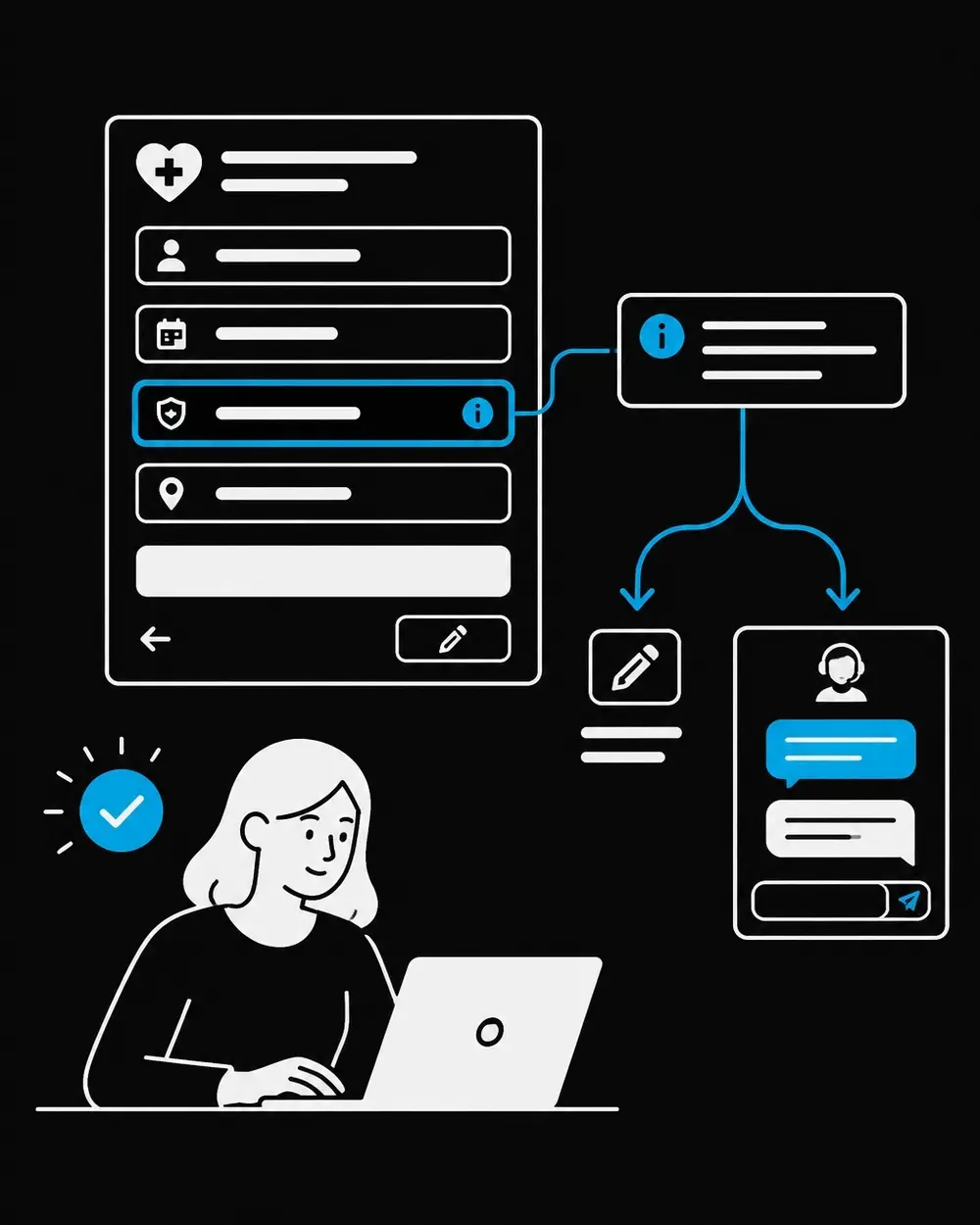
Self-service can reduce friction for routine tasks, but it should not become a dead end. Users need to know how to reach a person when a result is unclear, a process fails or a question requires individual attention.
A useful escalation path identifies available support channels, explains what each can address and sets accurate expectations about response timing. The interface should not imply that a clinician is monitoring a message in real time unless that is true. Nor should it label a general help resource as urgent clinical support.
A patient-portal usability study published in JMIR Human Factors identified navigation and comprehension challenges and described how uncertainty around health information can contribute to anxiety. The study reinforces a practical design principle: a screen that presents information without usable context or help can leave users to interpret too much on their own. Product and content teams should make the next step visible, with accessible alternatives for people who cannot use the default channel.

4. Use consistent patterns without hiding important differences
Consistent navigation, terminology, buttons and feedback help people understand where they are and what an action will do. Repeated patterns are especially valuable when users move between mobile apps, portals, email and service support.
Consistency is not the same as oversimplification. Similar-looking actions can have different consequences: saving a draft is not the same as submitting information, and reading educational content is not the same as receiving a diagnosis. The interface should make those distinctions explicit. Progress indicators, clear labels and confirmation screens help users see what has happened and what remains.
Accessibility is part of this foundation. An ADA compliant website design and accessible mobile app design services should account for keyboard access, screen-reader use, readable contrast, clear focus states and understandable language. These are not finishing touches. They affect whether people can complete tasks and interpret their options.
5. Reassure without manipulating
Reassurance offers clarity and support. Manipulation exploits worry to drive a decision. Healthcare products should avoid fear-based prompts, false urgency, shame, confusing defaults and obstructed cancellation or refusal paths. A warning should match the actual significance of the situation; routine actions should not be dressed up as emergencies to increase conversion.
The FDA’s human-factors guidance describes the role of usability engineering in reducing use errors that could affect patient safety for medical devices. It supports evaluating important workflows with representative users and realistic conditions. For digital health teams, that means testing whether people can understand choices and recover from mistakes, not simply whether they can move quickly through a happy-path prototype.
Teams should measure task completion alongside comprehension, error recovery, support access and user perceptions of pressure. Those measures help identify friction; they are local benchmarks for learning, not guarantees of clinical or business outcomes.
Skills: Turning Trust Principles Into Product Practice
Mr. Ortiz’s work combines hands-on design with product and business judgment: UI/UX design 95%, product management 95%, business acumen 90% and ADA compliance 90%. That blend supports discovery, journey mapping, prototyping, usability testing and iterative product improvement.
A focused UX UI design services engagement can examine the highest-stakes tasks first: consent, appointment booking, results, medication information, payments and support. Research with representative users can expose confusing terminology, inaccessible controls and misleading assumptions. A follow-up UX audit can then prioritize changes by user impact and operational relevance.
Testing should include people with different abilities, levels of digital confidence and familiarity with healthcare terms. Teams should examine stressful scenarios as well as routine use, including interruptions, failed submissions and uncertainty about who will respond. The patient-portal usability study offers relevant evidence on navigation and comprehension challenges, while the FDA guidance is specifically focused on medical-device human factors. Neither replaces context-specific research or an assessment of applicable requirements.
Healthcare trust is earned when interface behavior matches what the service actually does. Transparent data choices, honest errors, accessible escalation and consistent patterns give users more control without promising outcomes a product cannot guarantee. Teams seeking to improve a portal, app or care journey can get help with research, product design, accessibility and experience improvement.
References
• W3C: Understanding Success Criterion 3.3.1, Error Identification • W3C: Understanding Success Criterion 3.3.6, Error Prevention (All)
• FDA: Applying Human Factors and Usability Engineering to Medical Devices
• JMIR Human Factors: Optimizing the User Experience, Identifying Opportunities to Improve Use of an Inpatient Portal
This article is educational and is not legal or medical advice.


